Figma, Whimsical, Fathom, Google Suite, FigJam, Zoom
Project Background
The Problem
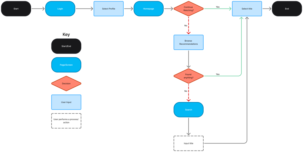
Do you ever sit down to watch your favorite show after a long day, you spend what feels like forever searching through multiple platforms to find it, but when you finally do, you no longer have the time or energy to watch?
In the cluttered world of streaming TV, a single, unified placeto access all your "Continue Watching" feeds from various platforms would bring order to the chaos.
Competitive Analysis
What They Have
Information about TV shows and movies
Can log what episodes or films a viewer has already watched
Some have information on where content is available
Key Learnings
Should have a direct connection to the user’s streaming platforms
Recommendations based on previous viewing seems to be a priority
Bulk tracking needed since users won’t be starting from zero
Apps like TV Time, Watched TV, and Hobi make it easy to search across streaming platforms, but they do not sync with a user’s existing accounts, leaving the user to manually track their watch history.
This creates a tedious and inefficientprocess.
Interviews
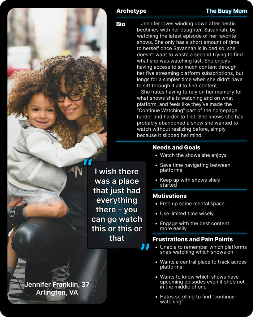
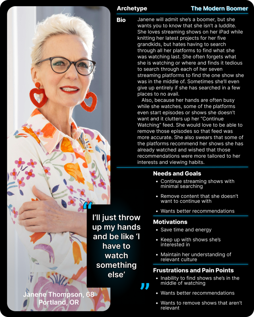
I conducted 45-minute user interviews over a week with five participants, who watch streaming TV from multiple platforms. I wanted to understand how tracking streaming television fits into daily life.
I askedthree main questions with my research:
What role does streaming TV play in people’s lives?
How do people organize their plans to watch?
When and how do people use a native “Continue Watching” feature?
What I Learned
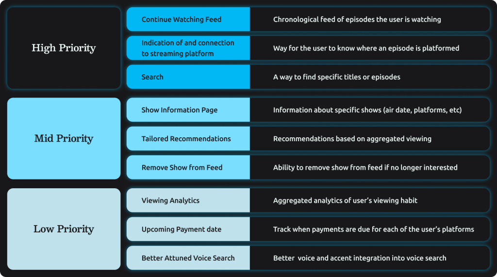
Using an affinity map I was able to pinpoint the most common problems:
Users enjoyed the abundance of available content despite the headaches
Most users were unable to track their viewing across platforms
All expressed frustration with having to remember where content is housed
Trust in recommendations has waned and there is room to improve how to tailor recommendations
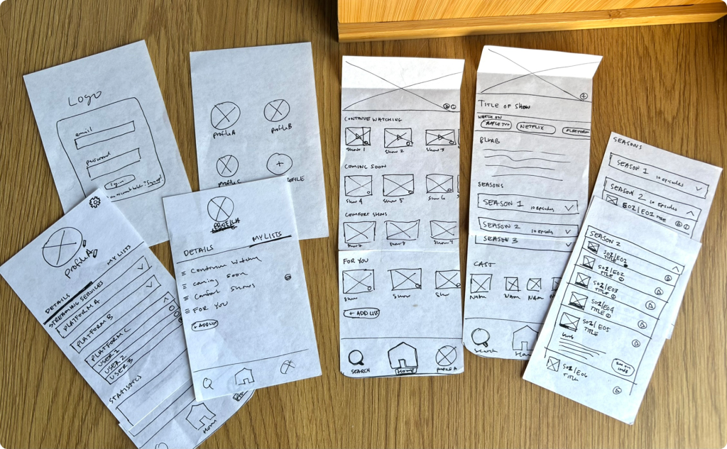
I created a lo-fi sketch prototype that I used for my first round of user testing. It helped me establish placement and understand users’ mind maps.
Branding
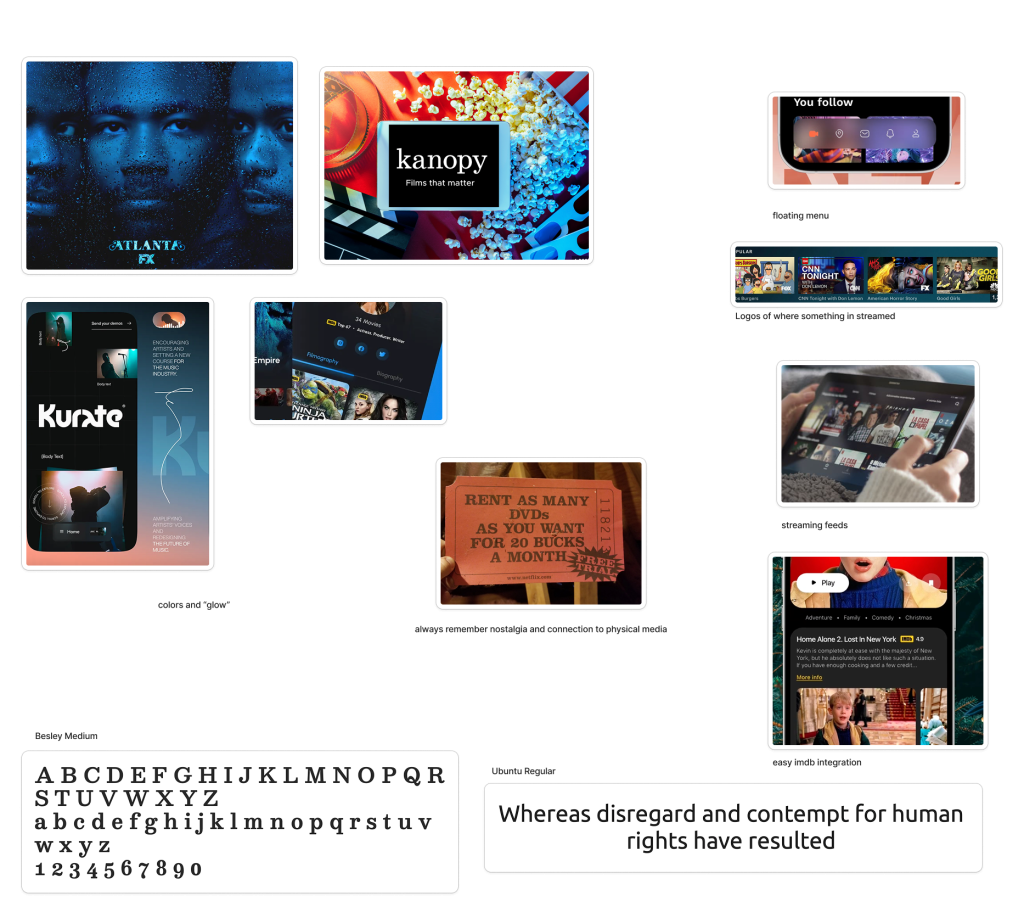
Mood Board
I wanted to explore the core brand values of dependability, seamlessness, and convenience as well as evoke a sense of nostalgia and a connection to physical media, as these elements play a significant role in shaping viewers’ perceptions and experiences.
Sketching
I sketched ideas around the original name, “Keep Watching” (with a bit of help from my eight-month-old), but quickly realized it was too generic to inspire a distinctive logo. After exploring various words and phrases that convey the idea of a list or queue of shows to watch, I eventually landed on the name “The Q.”
Digitizing Drafts
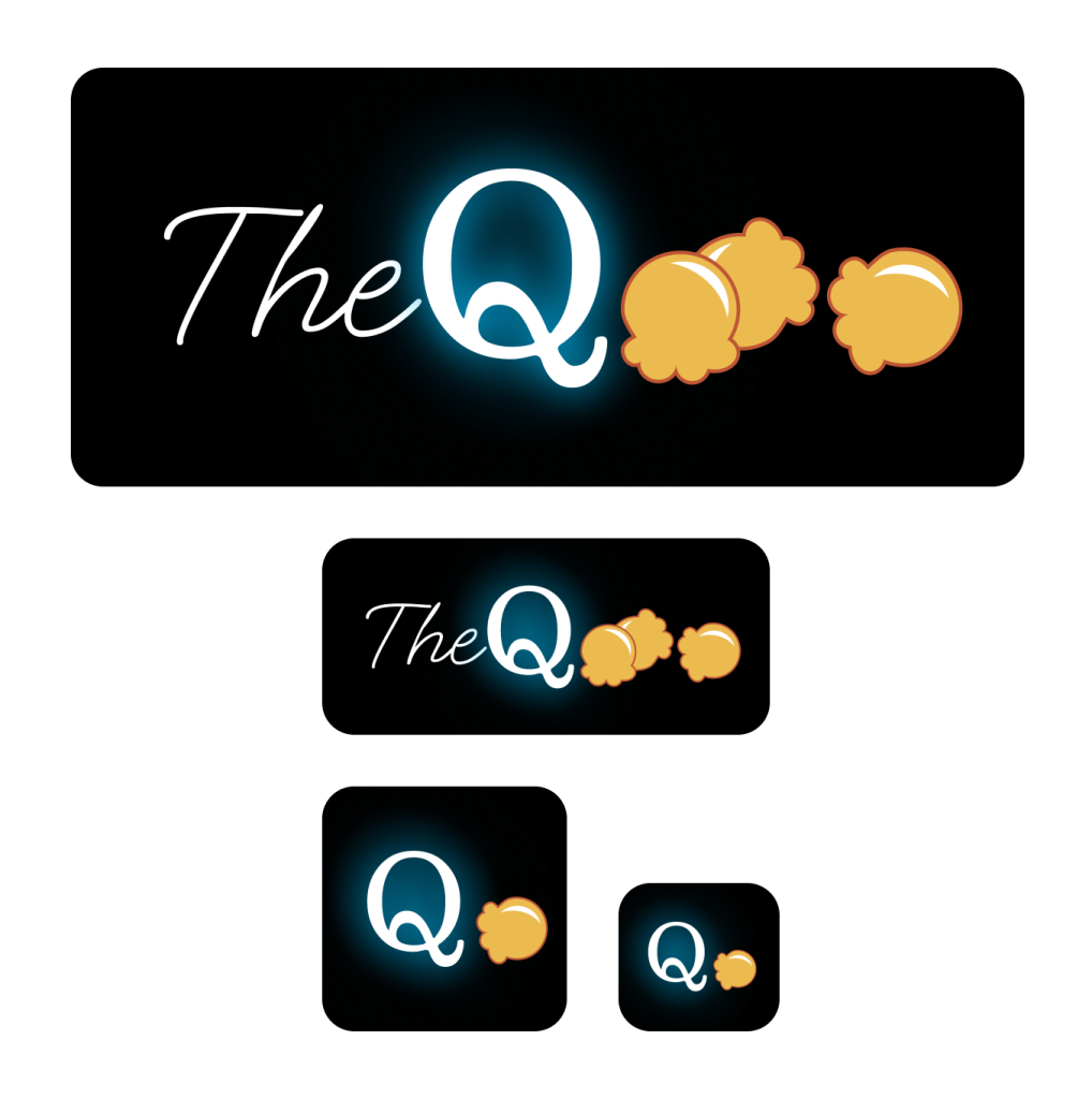
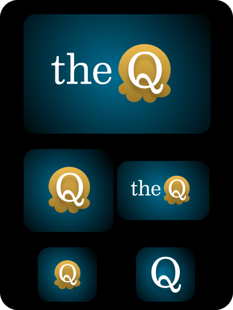
I wanted to incorporate the symbol of popcorn to evoke movie watching and use the the blue glow of a television in the dark. I experimented with a number of options and sizes to see what worked best.
Final Logo
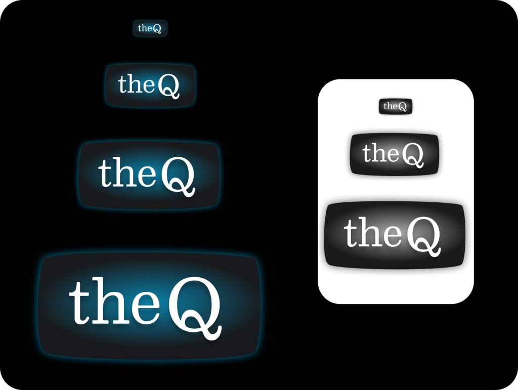
I landed on a simpler rounded rectangle to evoke the shape of an old-school cathode ray tube television, with a subtle glow behind the wordmark. Keeping “the” lowercase helped the “Q” stand out as the most distinctive feature.
Prototype
High Fidelity
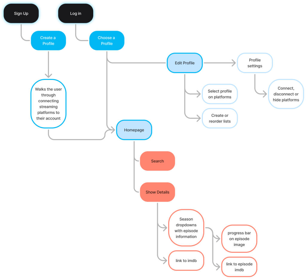
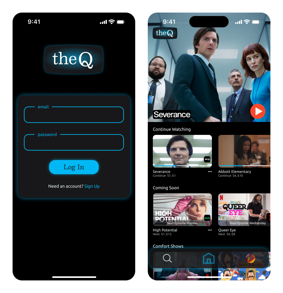
I created a high fidelity, click through prototype including a login page and a home page with multiple “continue watching” lists
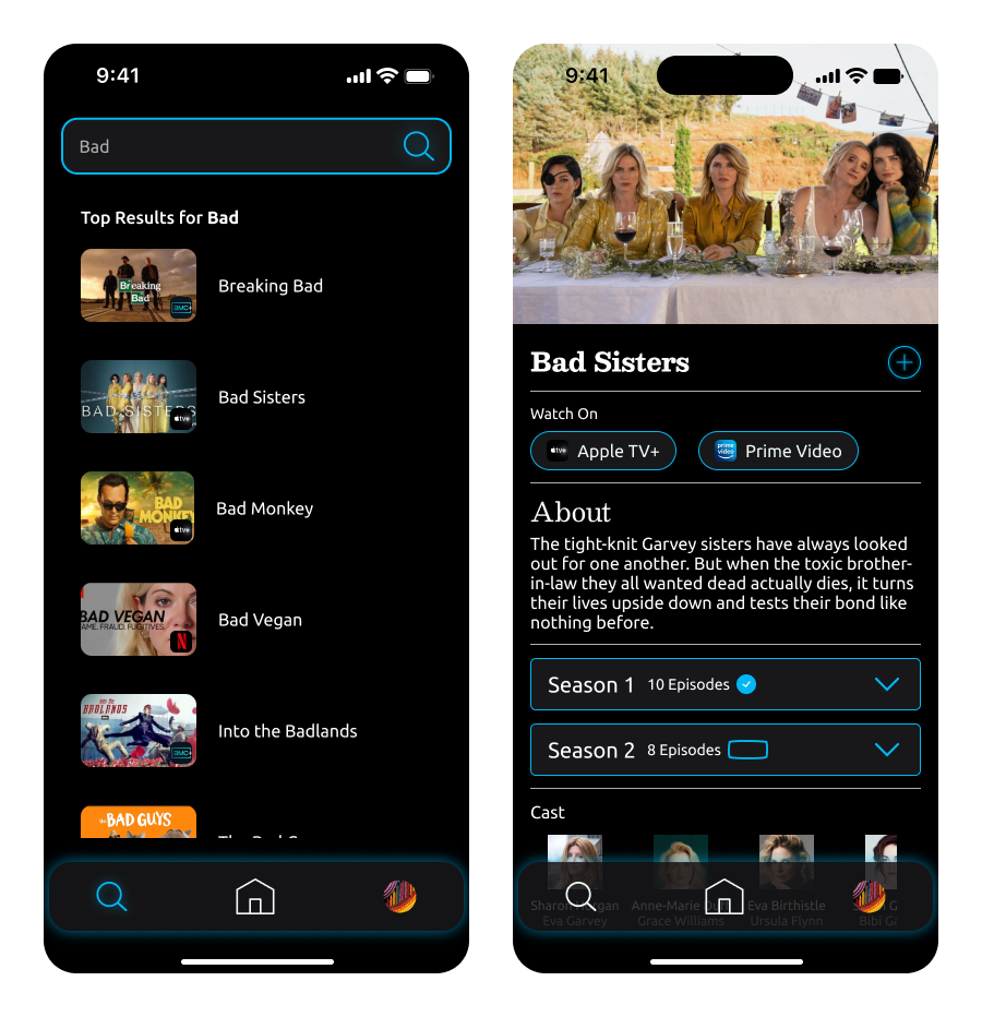
I also wanted to test the search functionality and see individual show and episode information
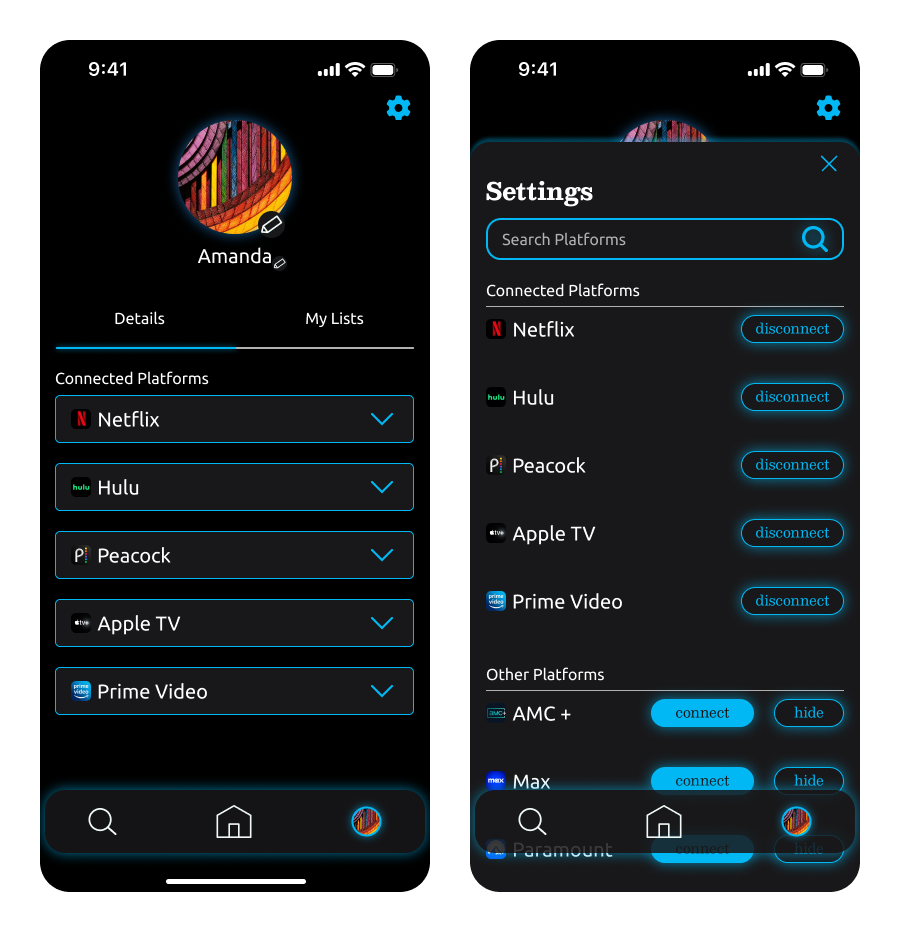
And, finally, to add a new streaming platform, I created a user profile and settings modal
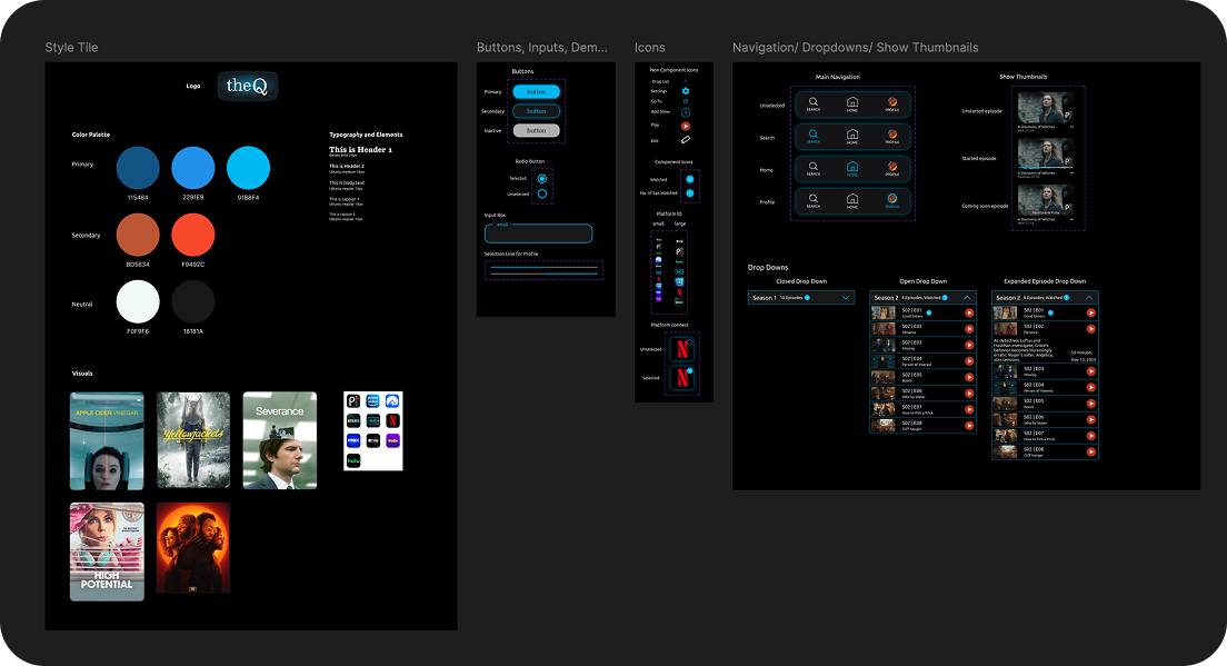
The Q Design System
User Testing
Goals
Evaluate whether users can navigate the tasks with low error rates
Gauge the app’s ease of use
Gain qualitative feedback from people who stream from multiple
Methodology
I completed five remote, moderated user tests. Four of my participants were repeats from my user interviews. All sessions were recorded to be able to refer to user comments and body language.
Tasks Tested
Log in and start watching most recent show
• Search, find more information, and start watchinga new show
• Register and connectstreaming platforms
• Adda streaming platform
Feedback
What's Working
100% of participants completed the first three tasks with one or fewer errors
100% of participants praised the clean, simple design and overall ease of use
100% of participants rated tasks 1-3 at a five (very easy to complete)
All participants were delighted by the signature “TV glow”
Some Thoughts from Participants
“It’s really convenient” – K.A.
“It’s a reprieve from the chaos” -S.H.
What Needs Improvement
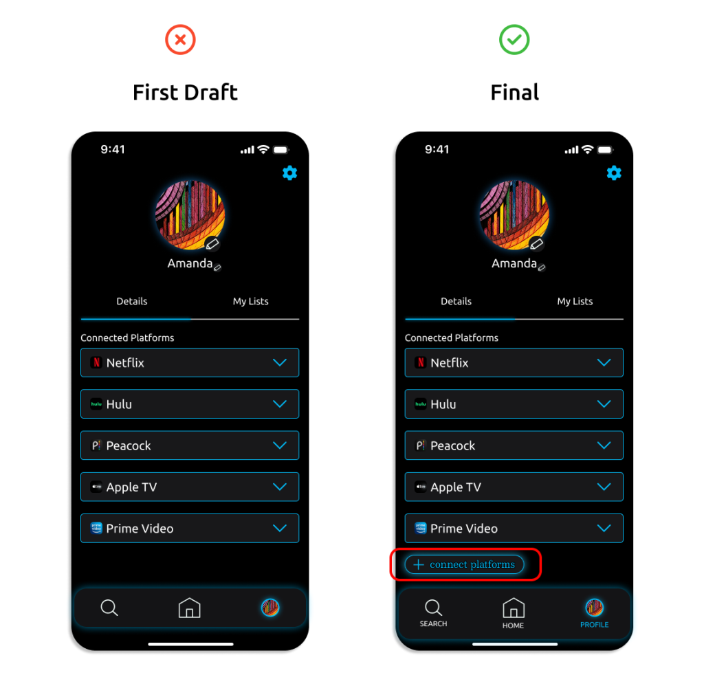
Three out of five users struggled to locate how to add a new platform
A few users had difficulty navigating the UI, indicating a need for better organization, hierarchy, and clarity in certain areas
Iterations
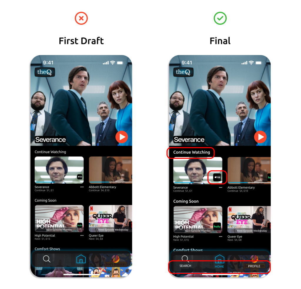
I adjusted the size and weight of the list titles to make the hierarchy clearer
I made the platform icon larger so it would be more immediately noticeable
I added titles to the navigation to make it more understandable and more accessible.
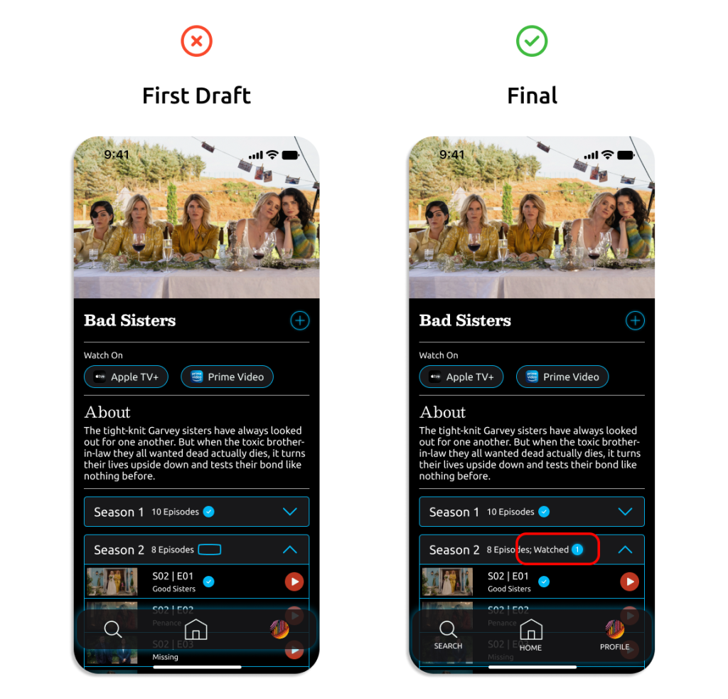
I replaced an unclear icon with a “watched __” label, featuring a circled number to indicate how many episodes had been watched.
Added a “Connect Platforms” button at the bottom of the list of already connected platforms which opens the settings modal window.
The streaming environment poses a unique set of challenges for viewers, especially as the landscape continues to diversify. Many old-school viewers long for a time when choices were simpler, but still enjoy the abundance of content available. The Q could reintroduce ease and organization into the streaming equation.
An app like The Q discourages viewers from deleting their streaming subscriptions by streamlining their viewing experience