
Project Details
Role
UX/UI Designer, UX Researcher, Testing
Timeline
December 2024 – January 2025
Tools Used
Figma, Whimsical, Fathom, Google Suite, FigJam, Zoom
Project Background
The Problem
Imagine a room filled with colorful characters with names like “Krafty Karen,” “Alexander Hammertime,” and “Sister Patricia Pistolwhip.” They emerge on a platform in front of you, ready to arm wrestle each other for a DIY trophy. They hustle you for donations to that night’s non-profit partner for the chance to be crowned the CLAWbucks Queen. They are The Los Angeles Lady Arms Wrestlers (LA LAW), a unique performance-based group on a mission to raise funds for small, woman- and queer-centered non-profits. Rooted in the heart of Los Angeles, their events have garnered a loyal following fueled by word-of-mouth and a strong social media presence. However, their founder and artistic director envisioned something more—a website that not only solidifies LA LAW’s place within the vibrant Los Angeles performance scene but also strengthens their connection to their audience, driving even more engagement and excitement for their cause.
Competitive Analysis
What They Have
- Easy to find images of the event
- Prominent location information
- Give users a sense of the event
- LA based with young, artistic audiences
Key Learnings
- There is an audience for smaller, live events in Los Angeles
- Emphasizing LA LAW’s unique theatricality will find the right audiencee
- Showcasing the connection to non-profits partners and community will help LA LAW stand out in the crowd
Events like Cinespia, an LA staple for over 20 years with a strong following, or Preciosa Night, founded by Instagram influencers for a POC, Latinx, queer audience, have websites that primarily serve functional purposes. However, their audiences are already established and don’t require ongoing efforts to attract new attendees. Emphasizing the unique feel of LA LAW events as well as showcasing their building of the local community through non-profit partnerships will help use its web presence to its utmost potential
Interviews
I conducted 45 minute user interviews with five participants, who attend live, queer events in Los Angeles, over the course of a week. I wanted to understand how live, queer events fit into daily life.
I asked four main questions with my research:
When and how do people find events?
How do people pick some events over others?
What stops people from going to certain events?
What causes repeat engagement?
What I Learned
Using an affinity map I was able to pinpoint the most common problems:
- Finding clear, detailed, and up-to-date information about events
- Needing a sense of the vibe of the event through current pictures and video
- Users want events to maintain a robust mailing list and presence on independent event aggregators so they can find event beyond just using Instagram.
- Making the favorites list persistent, either tied to a user account or across devices, and allowing users to have more than one
Research Synthesis
Problem Statements and “How Might We” Questions
Queer people in LA want to get a sense of the vibe of an event before attending, because they want to know it’s not going to be organizationally chaotic.
How might we get the feeling of a night with LA LAW across visually?
Prospective audience members want to have all of the possible event information ahead of time because traveling to and attending events in LA can be a draining process.
How might we provide clear and detailed event information in an appealing manner?
Prospective attendees want to stay up to date with upcoming event information because they’re tired of relying on social media algorithms to find independent events.
How might we drive email sign-ups to connect to best crowd for LA LAW?
Personas
I gathered insights and quotes from my interviews to create archetypes, helping me keep a clear picture of my users during the ideation phase.


By designing the site to match the chaotic and fun energy of LA LAW events and showcasing photos from past events, users will get an authentic feel for the vibe. Directing users toward email sign-up will help keep the LA LAW audience engaged and remind them of upcoming events, especially considering they happen on a more occasional basis.
Ideation
Features Prioritization
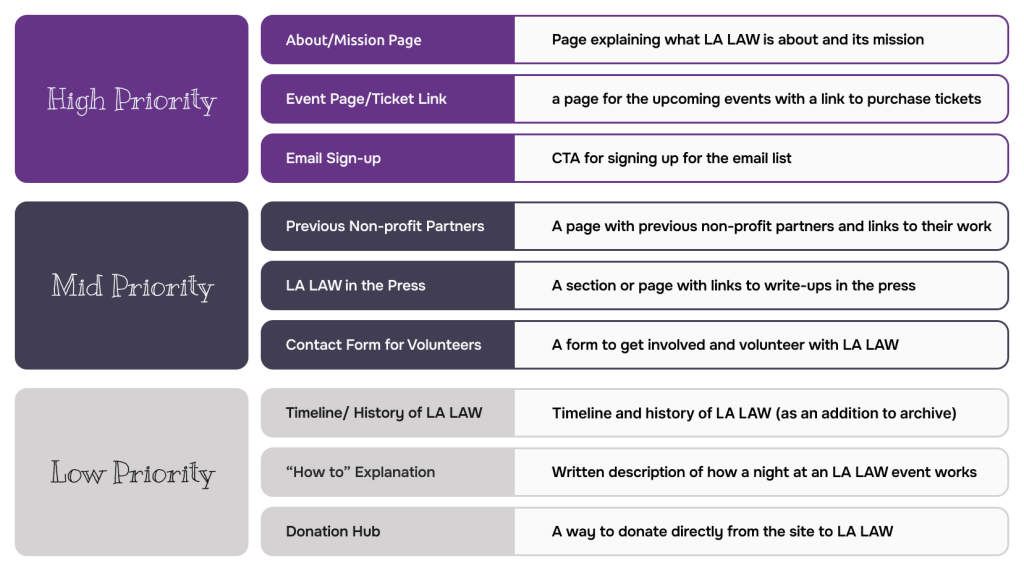
I developed and prioritized a list of features
Information Architecture
User Flow
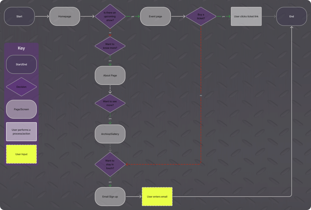
I created the user flow that I planned on prototyping: a ticket buying hero path and a “find out more” alternative path
Lo-fi Sketches
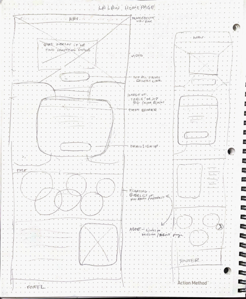
Sketches of the Homepage where I played around with and emphasized the DIY nature of LA LAW events while showcasing the “chaotic in a good way” feeling they provoke.


On the Mission/About and Archive pages I wanted to follow that overlapping and chaotic-shapes feeling from the homepage. Having the boxes be off center gives that DIY, raucous feeling.
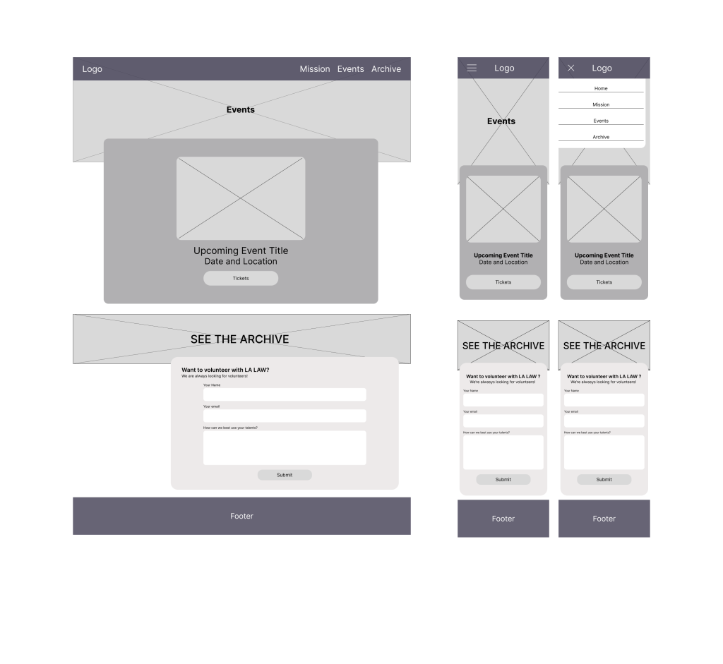
Because LA LAW often takes long breaks between events, I wanted the Events page to have more than just a ticket link. I included an image across the page that links to the archive page as well as a contact form that would allow folks to submit to volunteer with LA LAW.

Wireframes
Mid Fidelity Wireframes
I created click-through mid fidelity wireframes, so I could test the usability of the site and understand users’ mind maps.
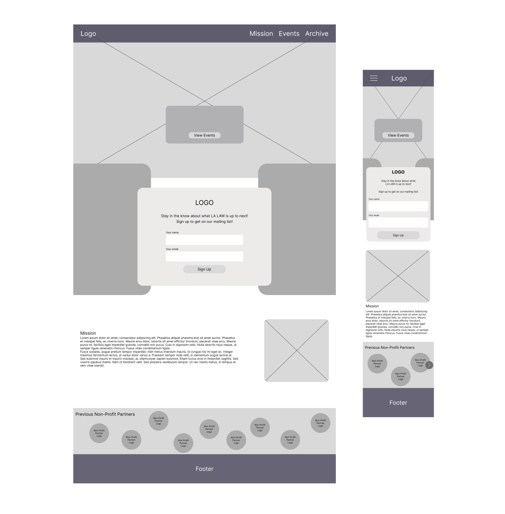
Most users found the prototype easy to use, but missed the ability to see more from the homepage. This helped me decide to add affordance in the mission blurb to show more was viewable
I wanted to test the functionality of the hamburger menu on the mobile site, so I included it in my mid fidelity prototype
Prototype
High Fidelity
I created a high fidelity, click through prototype for mobile and desktop starting with the Homepage


I also wanted to test how well the ticket-buying CTA would function on an Events page
I still wanted the Gallery pages to have that signature chaotic feel, so I played around with photo sizes within the gallery itself

I animated a few elements on the homepage including making a slideshow of wrestlers as the hero image and making the non-profit partners logos bounce within their frame. These moving parts helped give a sense of the in-your-face nature of LA LAW events.
User Testing
Goals
- Evaluate whether users are able to navigate through the tasks with a low error rate.
- Gauge the website’s ease of use.
- Gain qualitative feedback from Los Angeles event goers
Methodology
I completed five remote, moderated user tests. All five of my participants had also taken part in my user interviews. All sessions were recorded to be able to refer to user comments and body language.
Tasks Tested
Find out more information about LA LAW
Sign up for LA LAW's mailing list
Purchase tickets to the next event
Feedback
What's Working
100% of participants praised the site’s vibe, noting it effectively conveyed the event’s atmosphere
100% of participants completed the “Purchase Tickets” task in a few seconds with a zero error rate.
Some Thoughts from Participants
“That really gives me the vibe of the event!”
– K.J.
“I love the vibe. I think it’s simple!”
– A.M.
What Needs Improvement
- Users found having multiple CTAs (“view events” and “sign up”) confusing so clarifying which one should have prominence was a high priority.
- Zero out of five participants navigated to the “Archive” section to see photos of past events, showing that its purpose wasn’t clear.
- Three out of five users had difficulty navigating back to the homepage to sign up for the email list.
Iterations

- Cleaned up the double CTA of “view events” and “sign up” by moving the email sign-up to the footer, making it available across the site.
- Added a direct link to the gallery to encourage users to view past events
- Moved the social media links to the top navigation making them more easily accessible.

- I maintained the changes to the navigation and footer across the site
- I added time, price, and location details to the event card
- I changed “Archive” to “Gallery” to clarify its purpose
Key Takeaways
Reflection
A challenge I faced during this project was working with an actual client – trying to balance their desires with the needs of the users. During my research I discovered that websites for organizations like LA LAW are mostly perfunctory. However, having a website offers an organization a sense of legitimacy in the eyes of some event-goers, and can offer a place for users to build and maintain a connection with an organization. Ensuring that the website immediately conveyed the essence of LA LAW – so users would quickly understand whether it was an organization they wanted to engage with – became a key priority.
While most of my testers said they got the vibe of LA LAW, completing some of the tasks assigned proved difficult. Because seeing photos had been a top priority for users during the research phase, it was a key priority to make the gallery more prominent than it proved to be during testing. I also needed to make the email sign up more readily available whenever a user may think to do it.
I often try to describe LA LAW’s events to friends and just end up saying “it’s the craziest and most fun night out you’ll have in Los Angeles.”
Future Considerations
Having such an intimate knowledge of the organization was a huge advantage in creating something that truly represented LA LAW. However, the real challenge was translating that energy and feeling into design. I’d love to be able to actually build this site. It would be so useful for LA LAW to have a website, and I’m very proud of my design work.