
Project Details
Role
UX/UI Designer, UX Researcher, Testing
Timeline
November – December 2024
Tools Used
Figma, Whimsical, Fathom, Google Suite, FigJam, Zoom
Project Background
The Problem

Yoto bills itself as “the ultimate screen-free audio player for kids aged 3-12+.” and has a large e-commerce store where parents, family, and friends can purchase content. However, many users complain of purchasing the same card multiple times, leading to frustration and inefficiency.
To address this pain point, I explored a feature that would allow Yoto account holders to track the cards they’ve already purchased, helping them purchase more efficiently and avoid duplicates.
Competitive Analysis
What They Have
- Filterable shopping pages
- General tagging systems to assist filtering
- Some have account specific favorites and wishlists
Key Learnings
- Tagging content that a user has purchased removes the work of tracking that separately
- It would drive user loyalty
- Help users organize and bring them back to purchase new content
By helping users organize and navigate their content, Yoto can demonstrate an understanding of both the joys and challenges associated with managing collections.
Interviews
I conducted 45 minute, remote user interviews with eight Yoto users over the course of a week.
I wanted to ask these main questions
How do users decide which Yoto cards to buy?
What would cause a user to abandon purchasing Yoto cards?
What I Learned
Using an affinity map I found the most valuable improvements would be:
- Helping users navigate around cards they’ve already purchased more easily.
- Retaining the existing functionality of the filtering system while making some improvements
- Making the favorites list persistent across devices
Research Synthesis
Problem Statements and “How Might We” Questions
Busy parents want to browse and track purchases more easily because they are already short on time and energy.
How might we simplify the browsing and favoriting process to help users save time and energy?
Exhausted parents want to easily share gift ideas for their kids because friends and relatives always ask for them.
How might we assist parents with sharing their kids’ favorite cards?
Personas
I combined information and quotes from my interviews to craft archetypes.


Focusing on the needs of my personas helped me clearly address their pain points. I prioritized helping users organize already purchased cards to maintain brand loyalty
Ideation
Features Prioritization
I developed and prioritized a list of features

Information Architecture
User Flow
I created the user flow that I planned on prototyping: filtering out purchased cards

Lo-fi Sketches
Through user feedback and feasibility analysis, I prioritized an “In my Library” indicator and the ability to filter out those cards while browsing. I sketched on ways to hide purchased cards in the existing drawer menu, as well as catalogued what flags already existed on the site

Wireframes
Mid Fidelity Wireframes
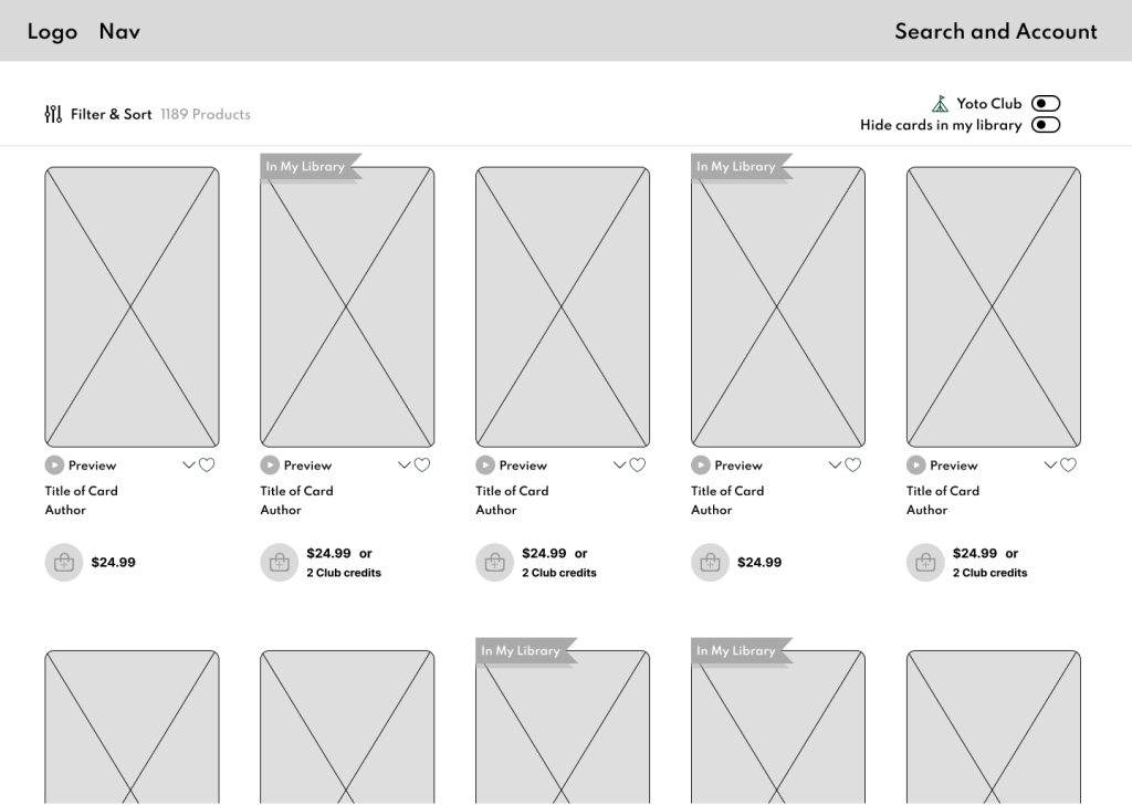
I created click-through mid fidelity wireframes, so I could test the usability of the purchased flag icon and a “hide cards in my library” toggle

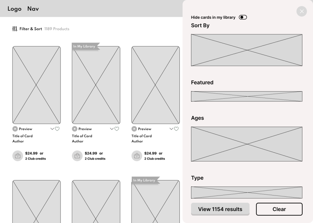
I also tested the toggle on the main page but users preferred it inside the drawer menu.
Prototype
High Fidelity
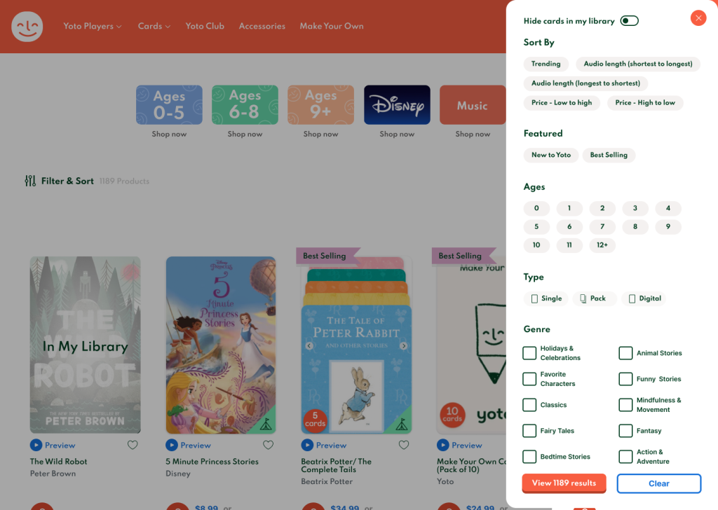
I created a high fidelity, click through prototype starting with Yoto’s account login modal

I recreated the Yoto card store and added the “Hide cards in my library” toggle in the existing drawer menu
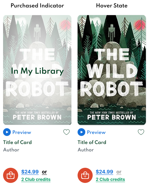
During mid-fidelity testing, I discovered that a small “purchased” flag icon wasn’t as noticeable to users as intended. To improve visibility, I designed an “In My Library” overlay to indicate which cards users already owned. I also added a hover state that temporarily removes the overlay, allowing users to view the cover art unobstructed if desired.
User Testing
Goals
- Evaluate whether users can navigate the task with a low error rate
- Gauge the feature’s ease of use
- Gain qualitative feedback from Yoto shoppers
Methodology
I completed five remote, moderated user tests. Each participant was an actual Yoto user. All sessions were recorded to be able to refer to user comments and body language.

Feedback
What's Working
100% of participants were able to complete the task with zero errors in one minute or less.
Participants found the “In My Library” overlay delightful and expressed that it was a feature they would love to have.
One participant even suggested that she might not hide her library; she enjoyed seeing which cards she had while browsing.
Participants viewed the feature as clean, efficient, and beneficial to their Yoto card store experience.
Some Thoughts from Participants
“Super useful and really well designed”
– K.M.
“Please make this!”
-E.C.
What Needs Improvement
- One participant mentioned that the toggle’s placement at the very top of the drawer menu made it slightly out of her line of sight.
- Three participants initially scrolled past the toggle before returning to it.
- The visual hierarchy between “Hide cards in my library” and “Sort By” made the toggle harder to notice.
- The toggle’s proximity to the “X” button in the drawer menu caused users to overlook it.
Iterations
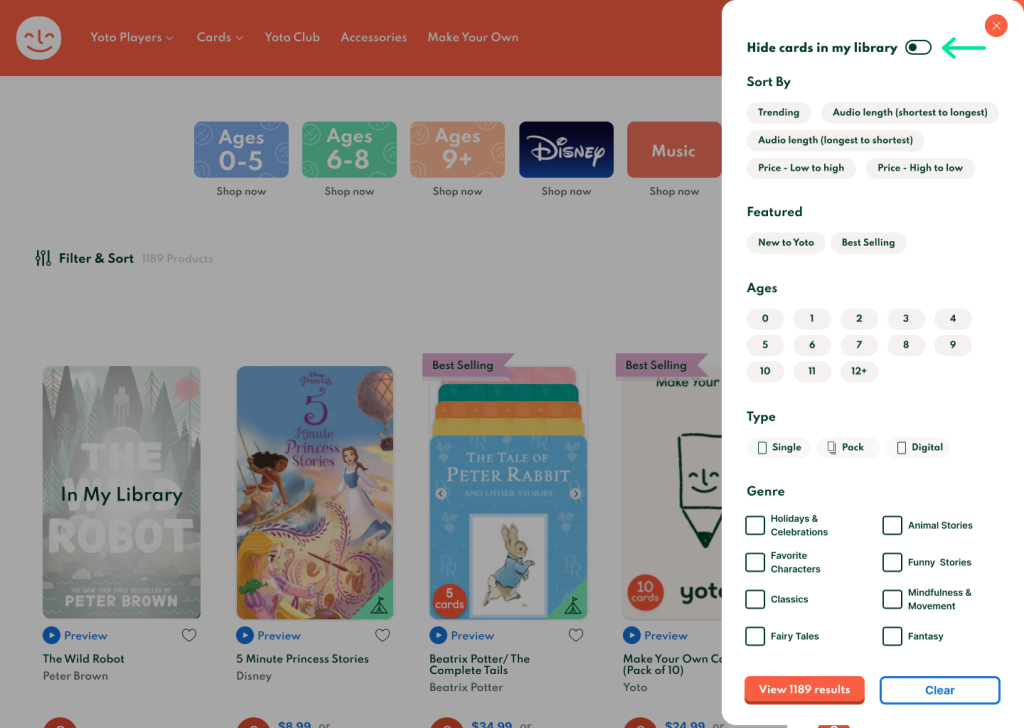
- Based on feedback and observations, I identified the need for better placement of the toggle to improve visibility and ease of access.
- I adjusted the hierarchy of elements in the drawer menu to ensure the toggle stood out more.
- I hypothesized that moving the toggle further away from the “X” could help users more easily see and interact with it.
Key Takeaways
Reflection
This project reaffirmed the power of user-centered design in enhancing digital shopping experiences. By implementing simple but effective tagging and filtering solutions, Yoto can create a more seamless and enjoyable purchasing journey for its customers.
Through my research, I identified several potential solutions to enhance user efficiency, but I had to carefully prioritize those that would deliver the most value to both users and the business. I quickly realized that a complex tagging system, which could address the limitations of the wishlist feature and track which cards users had already purchased, would be too intricate and waste development time. I focused my efforts instead on optimizing the user’s existing library, which my research indicated would have the most positive impact on the user experience.
This simple feature would have a significant impact on user satisfaction and brand loyalty particularly for a growing company like Yoto. This improvement, though modest, could yield outsized benefits for customer retention and engagement.

Future Considerations
Having a deep understanding of the Yoto ecosystem allowed me to easily connect with users and their needs. During this project, I observed that Yoto updated their wishlist system from being browser-specific to account-specific, which was one of my original feature ideas. This change reinforced that I was on the right track in terms of addressing the needs of Yoto’s users.
Several future opportunities could enrich the Yoto experience, such as introducing the ability to create multiple wishlists or enhancing gifting functionality. These features would add even more value to customers, creating more versatile and personalized experiences for users.